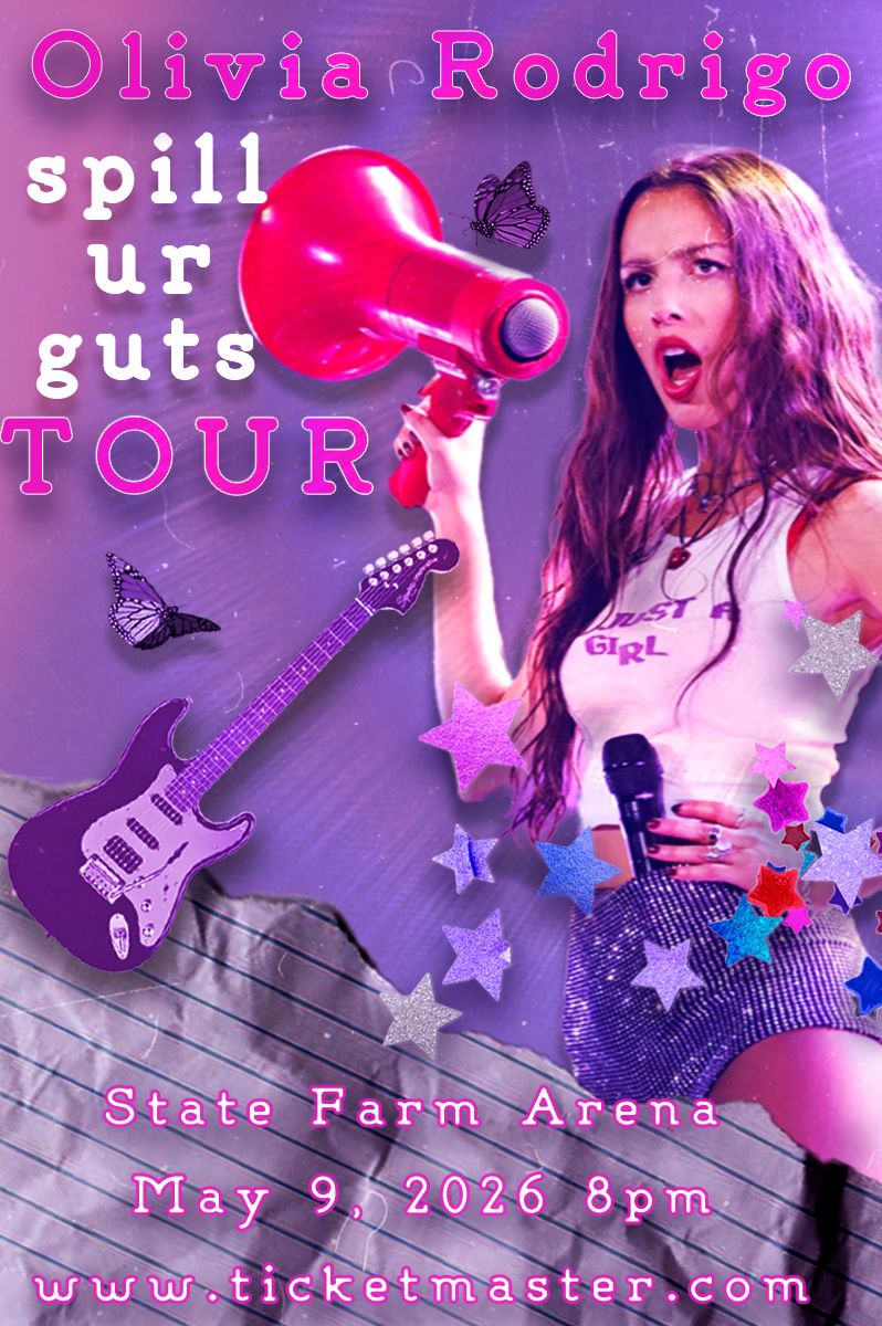
Olivia Rodrigo Concert Poster
What inspired this poster was Olivia Rodrigo's love of purple, messy aesthetics, butterflies, and rock aesthetics, I made sure to include butterflies, electric guitar, stars because they're heavily included in her merch and website, and a bright color scheme to keep viewer's engaged and drawn to the poster. I wanted Olivia to be the main focal point so they know it's her concert but also using contrasting colors so the viewer knows which information is most important. The font I used is very representative of her style because it's mainly seen on her merch. I made sure to credit the creator of the font i used.
Photos I Used + Credits
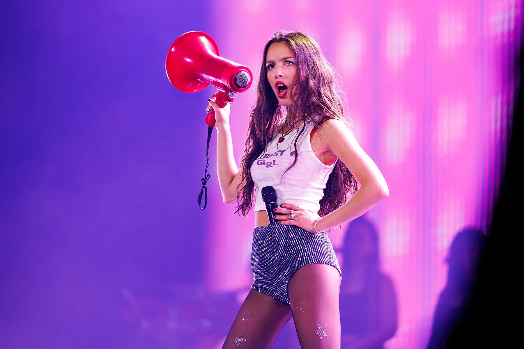 Image Source: Rolling Stones
What i did for this photo was i masked it, clipped an adjustment layer over, and added motion blur and drop shadow to make her pop off the screen and make her appear as shouting
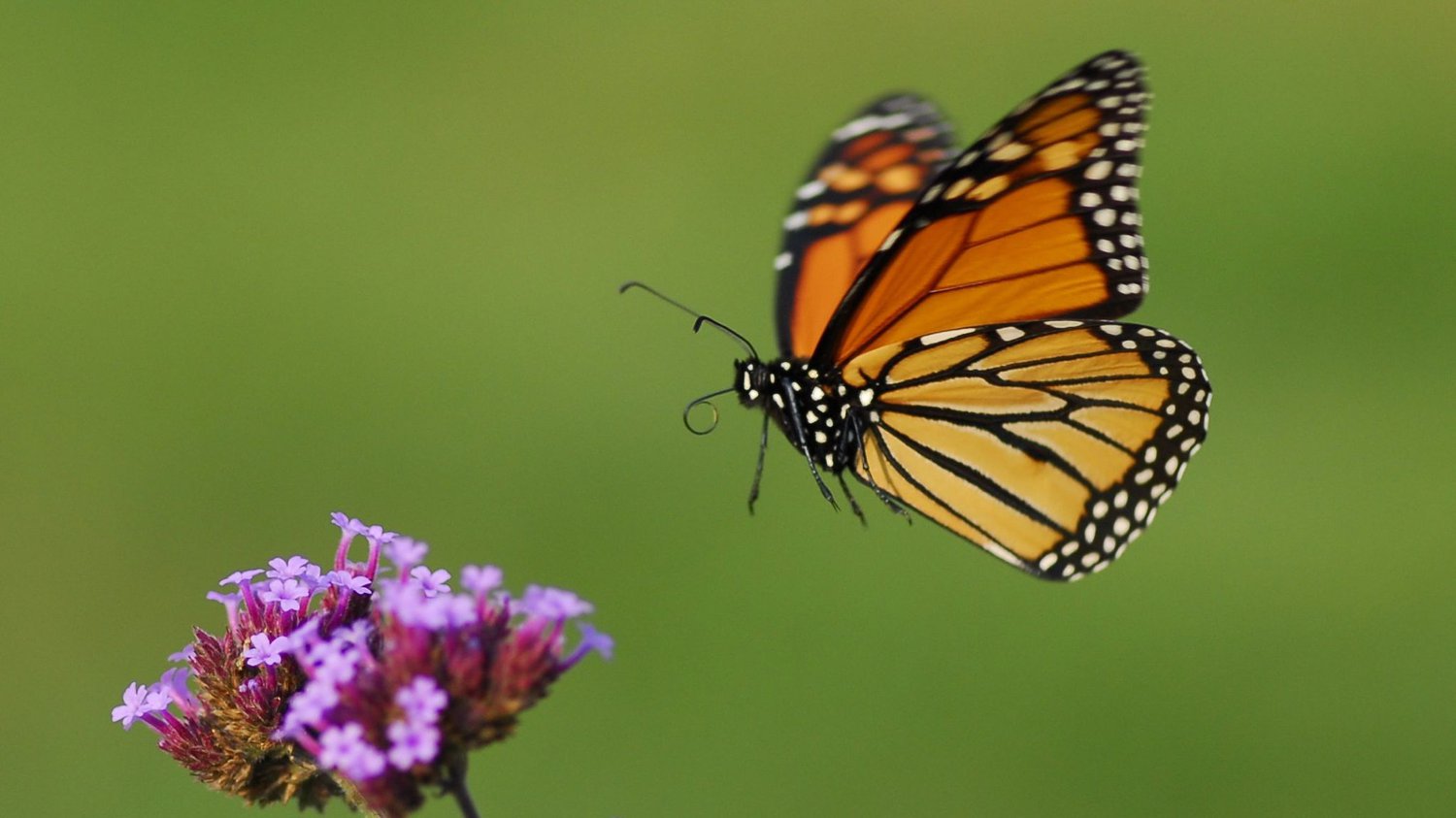 Image Source: PBS
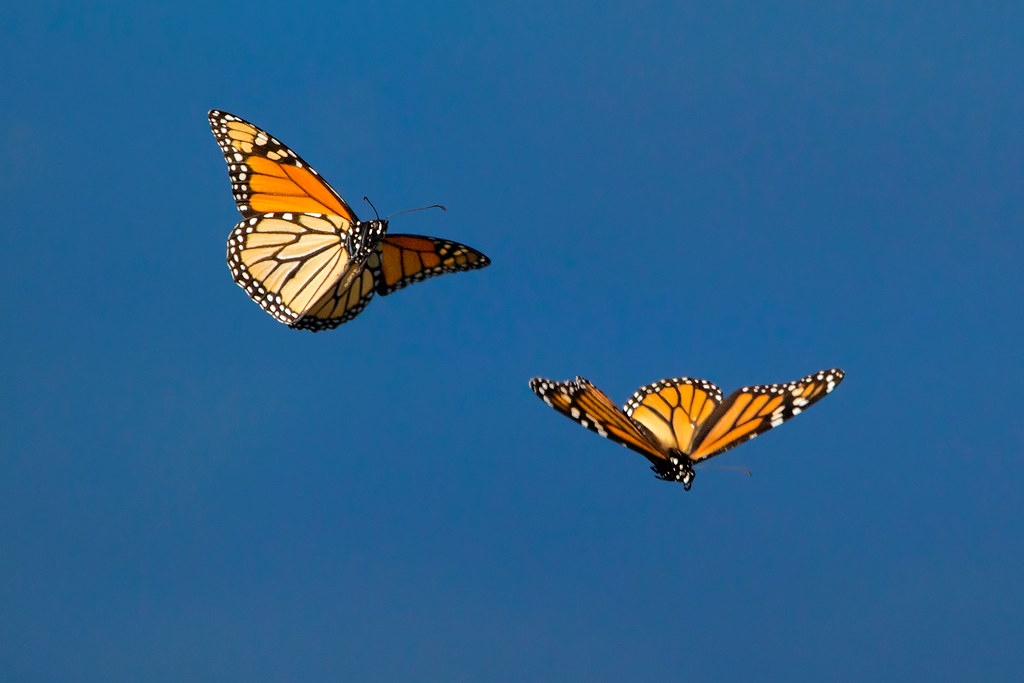 Image Source: Flickr
I masked the butterflies, clipped a hue/saturation adjustment layer to make them purple and placed a background shadow
 Image Source: Olivia Rodrigo Website
I masked the stars off of the background, Played around with the hue and saturation and also adjusted the placement and added a drop shadow
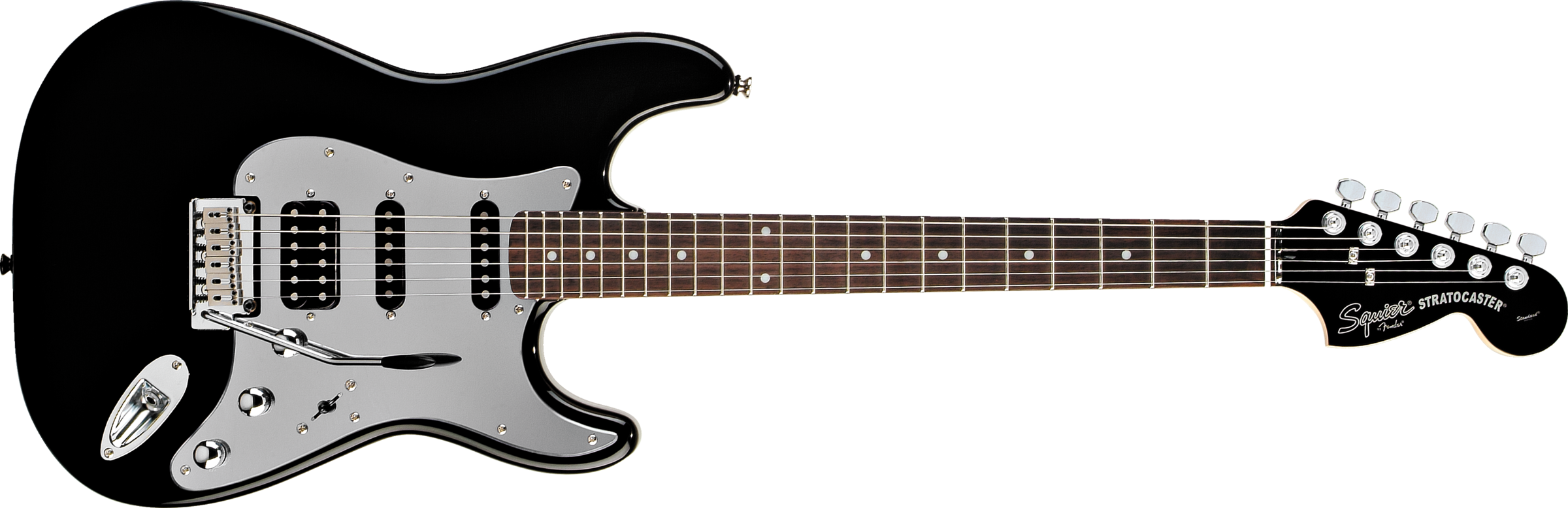 Image Source: PngImg.com
I played around with the hue and saturation and edited it to be a purple color to match the aesthetic of the poster I also added a drop shadow.
 Image Source: PNGAAA
For the page I transformed it to where it was upside down and on the side of the page, i used a clipping mask and curves to make it darker as a contrast
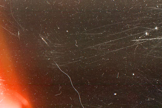 Image Source: Freepik
I overlayed the vintage overlay and then played around with the transparency to make sure it wasn't too overwhelming
 Image Source: Adobe Stock
As well as the previous overlay layer i played with the saturation and made the layer transparent.